Choosing the right paint colors for an office is not just about aesthetics. Color affects productivity, focus, collaboration, and how professional a space feels to clients and employees alike. A strategic approach to paint selection ensures each workspace supports how it is actually used. That is why working with an experienced commercial painter in St. Cloud, MN, makes a measurable difference in office outcomes.
Different office layouts demand different color strategies. Below is a breakdown of common commercial office layouts and the color approaches that work best for each, based on insights from a trusted commercial painter in St. Cloud, MN.
Open-Concept Offices
Open offices thrive on balance. Too much visual stimulation creates distraction, while bland color palettes drain energy. A seasoned commercial painter in St. Cloud, MN, typically recommends a layered but controlled approach.
Neutral Foundations with Accent Zones
Soft grays, warm whites, and light taupes keep large open areas feeling cohesive and professional. Accent walls in muted blues or greens can subtly define team zones without breaking visual flow. Many businesses rely on a professional to execute these transitions cleanly across large square footage.
Color to Control Noise and Movement
Darker accent tones near high-traffic areas help ground the space visually. Strategic contrast reduces the sense of chaos that open offices often suffer from, something an experienced commercial painter plans for during layout-based color consultations.
Private Offices and Executive Suites
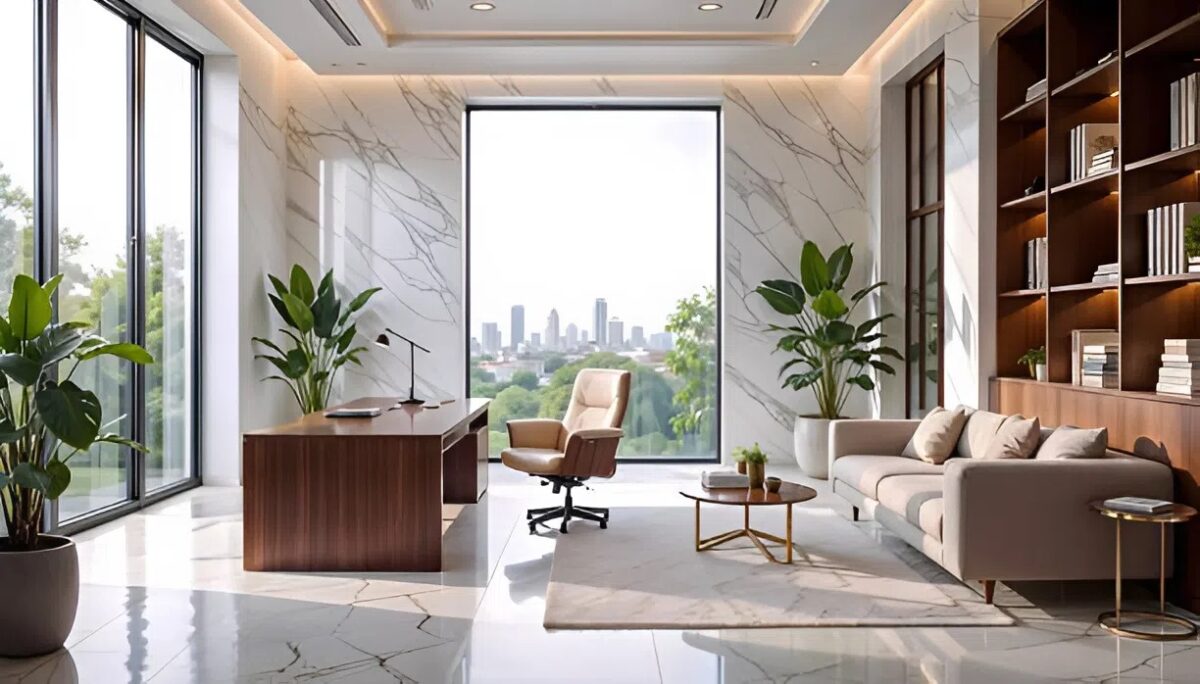
Private offices require a more tailored color strategy that reflects authority, focus, and comfort. A professional commercial painter in St. Cloud, MN, understands how color impacts decision-making environments.
Rich Neutrals and Sophisticated Depth
Warm charcoals, deep taupes, and muted navy tones convey confidence without overpowering the room. These colors photograph well, which matters for executive offices that host meetings or virtual calls. This is a common recommendation from a commercial painter working with leadership teams.
Accent Walls That Add Character
One well-placed accent wall behind a desk or credenza adds dimension without distraction. A skilled commercial painter in St. Cloud, MN, ensures the finish is flawless, as imperfections stand out more in darker shades.
Cubicle-Based Workspaces
Cubicle environments require color choices that reduce fatigue while maintaining consistency across repetitive layouts. This is where experience from a commercial painter in St. Cloud, MN, really shows.
Soft, Uniform Palettes
Light blues, sage greens, and warm off-whites help reduce eye strain during long workdays. These colors keep the environment calm while still feeling intentional, a balance that a commercial painter in St. Cloud, MN, regularly helps businesses achieve.
Branding Through Subtle Color
Instead of bold branding everywhere, cubicle areas benefit from subtle brand-color accents in shared zones. A professional painter can integrate these elements without overwhelming the workspace.
Conference Rooms and Meeting Spaces
Meeting rooms are performance spaces. Color choices should encourage focus, collaboration, and clarity. A knowledgeable commercial painter in St. Cloud, MN, considers both lighting and room purpose when planning these areas.
Colors That Encourage Discussion
Mid-tone blues and greens promote calm communication, while warm neutrals prevent the space from feeling sterile. A commercial painter often recommends avoiding stark whites, which can feel harsh under artificial lighting.
Visual Anchors for Presentations
Darker feature walls behind screens or whiteboards help presentations stand out. This functional design choice is commonly implemented by a commercial painter familiar with modern meeting room needs.
Break Rooms and Collaboration Areas
These spaces should feel different from work zones without clashing with the overall office design. A strategic commercial painter in St. Cloud, MN, uses color to signal relaxation and creativity.
Energizing but Controlled Color Choices
Warm yellows, soft terracottas, or muted greens add life without becoming distracting. A professional painter often tones these colors down slightly to maintain professionalism.
Durable Finishes Matter
Break rooms see more wear, so washable, scuff-resistant finishes are essential. This is where working with a commercial painter ensures both design and durability are addressed.
Why Layout-Based Color Planning Matters
Office paint should support how a space functions, not just how it looks. A layout-first approach reduces costly repaints, improves employee experience, and creates consistency across the workplace. Partnering with a knowledgeable commercial painter in St. Cloud, MN, ensures color decisions are intentional, scalable, and aligned with long-term business goals.
When color selection is approached strategically, offices become more productive, more professional, and more inviting. That is the difference a trusted commercial painter in St. Cloud, MN, brings to every project.
Choose Heartland Painting: Your Trusted Commercial Painter in St. Cloud, MN
When your office needs more than just a fresh coat of paint, Heartland Painting delivers strategy, precision, and results that last. As a reliable commercial painter in St. Cloud, MN, our team works closely with business owners, property managers, and facility teams to plan color schemes that match each office layout, brand identity, and day-to-day operations.
Ready to upgrade your workspace with thoughtful color planning and expert execution? Connect with Heartland Painting today.